How to Use Color Psychology in Modern Design
Color isn’t just decoration—it sets mood, guides attention, and shapes behavior. Used intentionally, it clarifies hierarchy, boosts conversions, and strengthens brand perception across websites, apps, and products.
Why Color Psychology Matters
Modern design lives in split-second decisions. Color helps users scan interfaces, trust brands, and act confidently. It can reduce cognitive load, differentiate actions, and make content feel inviting or urgent—without extra words.
Core Color Meanings (and When to Use Them)
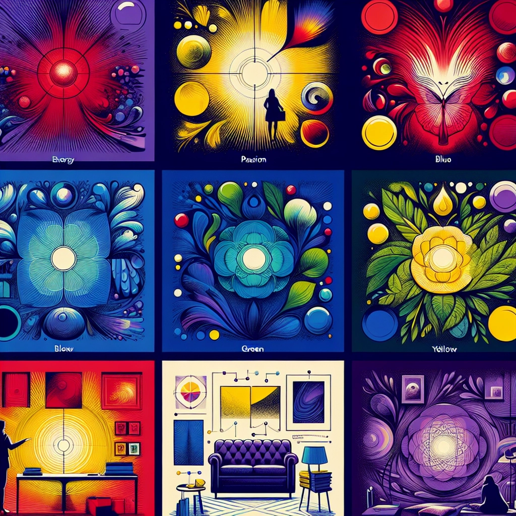
- Red: energy, urgency, danger—alerts, destructive actions, time-sensitive CTAs.
- Orange: friendly, energetic—onboarding prompts, upgrades, nudges.
- Yellow: optimism, attention—highlights, warnings (use sparingly).
- Green: success, growth—confirmations, progress, eco/finance cues.
- Blue: trust, calm—backgrounds, navigation, fintech/health.
- Purple: creativity, premium—brand accents, premium tiers.
- Black/White/Gray: elegance, clarity, neutrality—typography, spacing, surfaces.
Context matters: colors shift by culture (e.g., white signifies mourning in parts of Asia; red signals luck in China). Temperature, saturation, and value also change emotion—muted palettes feel mature; vivid ones feel dynamic.
Building a Purposeful Palette
- Define goals and audience. Choose the emotion you want to evoke.
- Select a base brand color, 1–2 accent action colors, and reliable neutrals.
- Establish hierarchy: primary vs. secondary CTAs; states for hover, focus, disabled, error, success.
- Control intensity: tints for backgrounds, shades for emphasis; avoid over-saturation.
- Check accessibility: target ≥4.5:1 contrast for body text and 3:1 for large text/icons; verify color-blind safety.
- Plan for modes: dark mode, high-contrast settings, and system themes.
Practical Tips for Modern UIs
- Use warm tones to drive action; cool tones to reassure and stabilize.
- Reserve the most vibrant hue for the primary action to reduce visual noise.
- Keep semantic consistency: red = error, green = success, blue = info.
- Test in real components: forms, charts, empty states, notifications, toasts.
- A/B test CTA color with identical copy; measure clicks, time-to-task, and error rates.
- Localize palettes for markets with different symbolism and expectations.
As a rule of thumb: one primary brand color, one success, one warning, one danger, and two neutrals—with accents covering no more than 10% of the screen at once. Thoughtful color choices align emotion with function, improving clarity, trust, and conversion—quietly and effectively.


